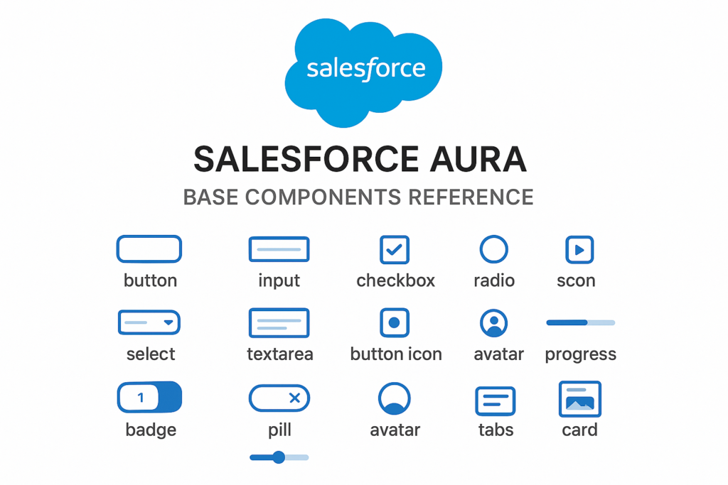
Salesforce Aura Base Components Reference
Aura Base Components
Aura base components are foundational, ready-to-use HTML and CSS UI components provided by Salesforce. They ensure consistent design and behavior across Salesforce apps, and follow SLDS (Salesforce Lightning Design System).
These components can be used in Aura Components, and are styled according to Salesforce’s Lightning Design System.
Below is a categorized list of Aura Base Components:
Buttons
| Base Component Name | Usage |
| lightning:button | Standard button. |
| lightning:buttonIconStateful | Stateful icon button. |
| lightning:buttonMenu | Dropdown menu button. |
Form Components
| Base Component Name | Usage |
| lightning:input | Text, email, checkbox, radio, etc. |
| lightning:textarea | Multiline input. |
| lightning:inputRichText | Rich text editor. |
| lightning:checkboxGroup | Multiple checkboxes. |
| lightning:radioGroup | Multiple radio buttons. |
| lightning:combobox | Dropdown with search. |
| lightning:dualListbox | Two-pane list selection. |
| lightning:slider | Range slider. |
| lightning:toggle | On/off toggle switch. |
| lightning:helptext | Small help icon with tooltip. |
File Upload & Select
| Base Component Name | Usage |
| lightning:fileUpload | File upload UI. |
| lightning:select | Standard dropdown select. |
Data Display
| Base Component Name | Usage |
| lightning:datatable | Table with sorting, actions, etc. |
| lightning:recordForm | Auto-generated form for viewing/editing records. |
| lightning:recordEditForm | Customizable record edit form. |
| lightning:recordViewForm | Customizable record view form. |
| lightning:outputField | Read-only field. |
| lightning:inputField | Editable field within forms. |
Navigation and Layout
| Base Component Name | Usage |
| lightning:layout | Responsive layout structure. |
| lightning:layoutItem | Child for lightning:layout. |
| lightning:tabset | Tab container. |
| lightning:tab | Individual tab. |
| lightning:accordion | Collapsible sections. |
| lightning:accordionSection | Individual accordion panel. |
| lightning:breadcrumb | Navigation path links. |
| lightning:menuDivider | Menu divider. |
| lightning:menuItem | Menu item. |
| lightning:menuSubheader | Menu sub-header. |
Messaging and Feedback
| Base Component Name | Usage |
| lightning:notificationsLibrary | Toast messages (via JavaScript). |
| lightning:spinner | Loading indicator. |
| lightning:badge | Small status label. |
| lightning:pill | Capsule UI (e.g., tags). |
| lightning:pillContainer | Container for pills. |
Modals and Dialogs
| Base Component Name | Usage |
| lightning:overlayLibrary | Used for modal dialogs in Aura. |
Cards and Containers
| Base Component Name | Usage |
| lightning:card | Container with header and body. |
| lightning:tile | Used to display a record or summary. |
Icons and Images
| Base Component Name | Usage |
| lightning:icon | SLDS icons. |
| lightning:avatar | User avatars/images. |
Picklists and Lookups
| Base Component Name | Usage |
| lightning:combobox | Standard picklist. |
| lightning:lookup | Lookup component (Aura). |
Other Utilities (Read-only formatted display)
| Base Component Name | Usage |
| lightning:formattedText | Display plain text |
| lightning:formattedNumber | Display formatted number |
| lightning:formattedUrl | Display clickable link |
| lightning:formattedRichText | Display rich text |
| lightning:formattedDateTime | Display formatted date-time |
| lightning:formattedEmail | Display formatted email |
| lightning:formattedPhone | Display formatted phone |